RSPCA KNOWLEDGEBASEPrototyping the content discovery experience of Australia’s most trusted source of animal welfare science

Role
UX/UI Designer. Created with Harness Projects.
Timeline
8 weeks - October to December 2022.
Background
RSPCA Knowledgebase is Australia’s key source of animal welfare science, advice, and information where users can browse articles in the format of questions.
RSPCA tasked us to learn:
How the Knowledgebase is being used, if the information is valuable and what features can be optimised.
Users’ sentiment towards a donation request feature and our recommendations on best format.
CONTEXTProcess
It’s overwhelming and difficult for pet owners to find advice they can trust
PROBLEMPet owners find sorting through large volumes of results, categories, and text for the right information overwhelming and complicated.
Key Improvements
SOLUTION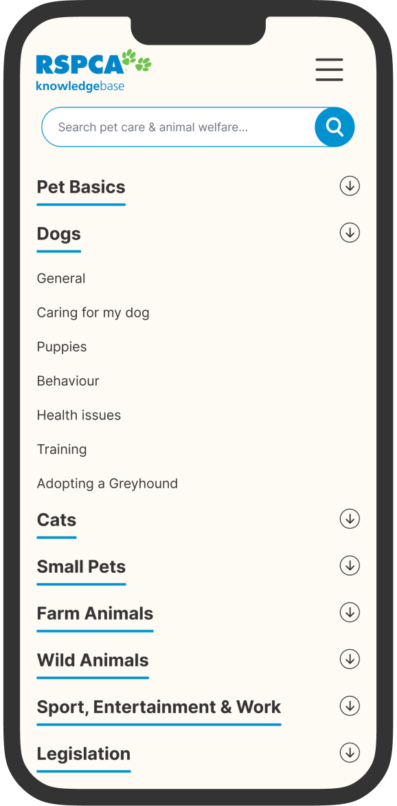
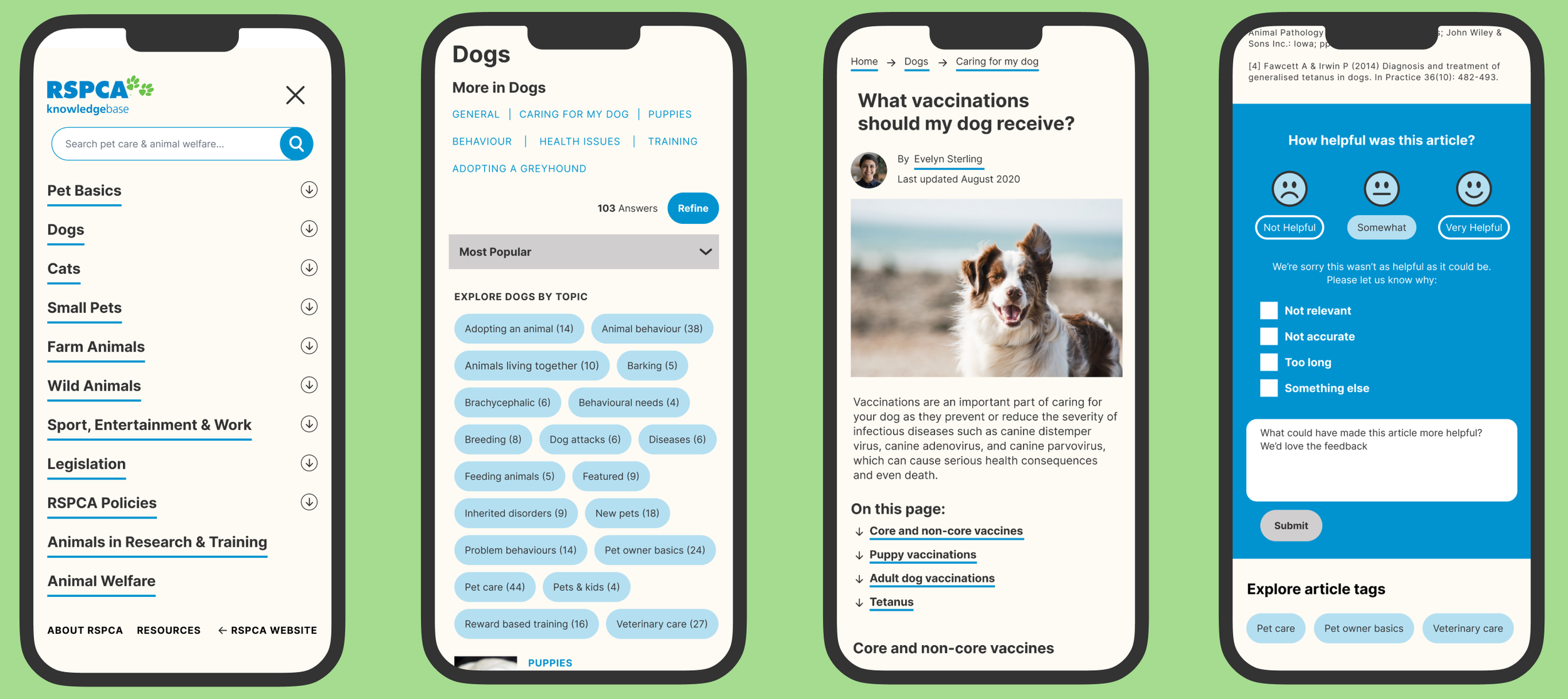
Increasing Findability & Control
Visible global navigation that brings the most viewed pet categories to the surface
Local navigation to help users orient themselves, explore the current category
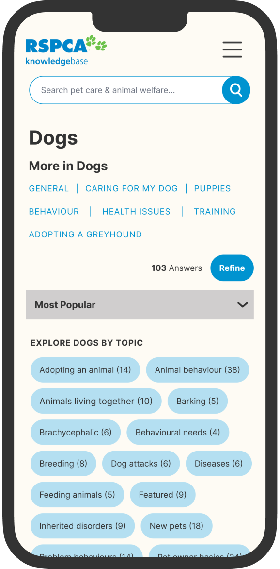
Articles sorted by most popular to show the most relevant answers first
Refine feature to narrow down results by familiar topic tags in conversational language

Summarising article content, utilising topic sub-headers to reduce overwhelm and support users to find the answer faster

Providing Credibility & Relevancy
Listing the author’s name, profile image, and last updated date provides users with peace of mind and human connection to establish credibility and content relevancy instantly.

Gathering Meaningful Feedback
Shifting the question from “was this article helpful?” to “how helpful was this article?” gives three points to differentiate responses rather than binary yes or no.
Multiple choice reasons and a free-text answer box to learn more about their earlier answer.
Overall, benchmark data points are reset to provide more actionable feedback to reduce bounce rates
UNDERSTANDStakeholder Interview
We conducted a stakeholder interview with the Communications & Campaign Lead at RSPCA. These key insights lead to building an opportunity canvas that clarifies the business problems, user benefits, potential solutions, and specific metrics for success.
User Behaviour
The majority of users arrive on pet-related article pages from organic traffic with an issue
The Knowledgebase receives millions of visitors annually but has a high bounce rate
Users can rate if the article was helpful or not but RSPCA doesn’t know what to do with the feedback
Business Goals
Balance educating readers on how to care for their animals better with raising awareness of greater campaign issues
Reach as many users as possible while maintaining accurate content internally
Monetise the Knowledge base but keep content free, accessible, and unsponsored
User Interviews
From this process, we consolidated our interview goals and questions. We interviewed two users each and drew key insights from the collective 24 user interviews. These eventually lead to design opportunities.

Key Insights
Often users felt overwhelmed when searching through large amounts of information and wanted to-the-point answers
Users seek consistent information from multiple sources to validate advice
Advice from people with animal experience or qualifications is regarded highly
Users were more likely to engage with websites that had simple, obvious ways to navigate to the right information
A donation feature did not feel relevant to the Knowledgebase
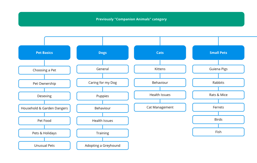
To help understand what content users find most valuable, I reviewed google analytics. These insights lead to sitemap improvements to better support users’ goals.
85% of the top 50 articles were from the companion animals category
75% of the top 30 sub-categories were from companion animals
Birds, Ferrets, and Guinea Pigs are in the top 10 categories with Dogs & Cats
Sitemap
Understanding users needs & framing the problem
DEFINEBased on the 24 pet owners interviewed, I created a persona to clarify user’s needs, pain points, and behaviours.
Based on key findings, how might we’s were formed to frame the problem and help inspire ideas for the next stage.
HMW help users find an answer quickly and intuitively?
HMW we reassure users they’re doing the right thing for their pet?
HMW we promote discovery of greater issue articles?
IDEATIONSketching
Using the persona and HMW to guide the ideation I explored the user’s experience searching for an answer plus a donation feature. Moving into wireframes I chose to narrow my focus on improving the navigation and article page structure based on the earlier insight that users did not find a donation feature relevant.
DELIVERUsability Testing
Usability testing was conducted with three participants and revealed the interface wasn’t intuitive enough.
All users tried the search feature first
Users were unsure which category name to select to navigate to the right place
Clicking and scrolling through categories for an answer was frustrating
Users were unsure how articles were sorted and expected popular articles to appear first
Improvements
Based on user feedback, I iterated to increase the number of ways users can navigate to an article efficiently. Keeping in mind most users land on an article from Google and need ways to quickly orient themselves, continue exploring relevant topics quickly if the first answer is not the most relevant.
Wireframe user flow
REFINEMENTFinal Product
What I’d do differently
This was my first ever UX project, here are the two key things I would have done differently.
Test the current website user experience
While our user interviews primarily addressed the overall experience of pet owners when searching for animal care information, they did not provide a clear understanding of the level of value offered by the Knowledgebase content or the common issues users face. Conducting usability testing on the current Knowledgebase could have been beneficial in refining opportunities and guiding the direction of design solutions.Stay focused on designing for user goals
In my first iteration of wireframes, I spent a lot of time auditing the information architecture and prototyping two categories (dog + wild animals) to show how a three-tiered hierarchy would function. In hindsight, due to project time constraints, it would have been wiser to explore more solutions for users to discover content earlier on (E.g. customisation). Rather than being consumed by less important but more time-intensive tasks of information architecture and the logic of multi-tiered categories.
This project emphasised how important it is to regularly iterate and test the user experience. This process is crucial for validating ideas and maximizing resources to meet business goals and user needs.
REFLECTION
