A sustainable e-commerce grocer with environmental transparency for eco-conscious millennials
YOUR FOOD COLLECTIVE
CONTEXTRole
UX/UI designer. Created with Harness Projects.
Timeline
8 weeks - April to May 2023.
Background
Your Food Collective is a sustainable e-commerce grocer with the mission to re-create our food system through data-driven transparency.
We were tasked to design elements that communicate environmental impact measurements, defend against greenwashing claims and empower consumers to make better food choices.
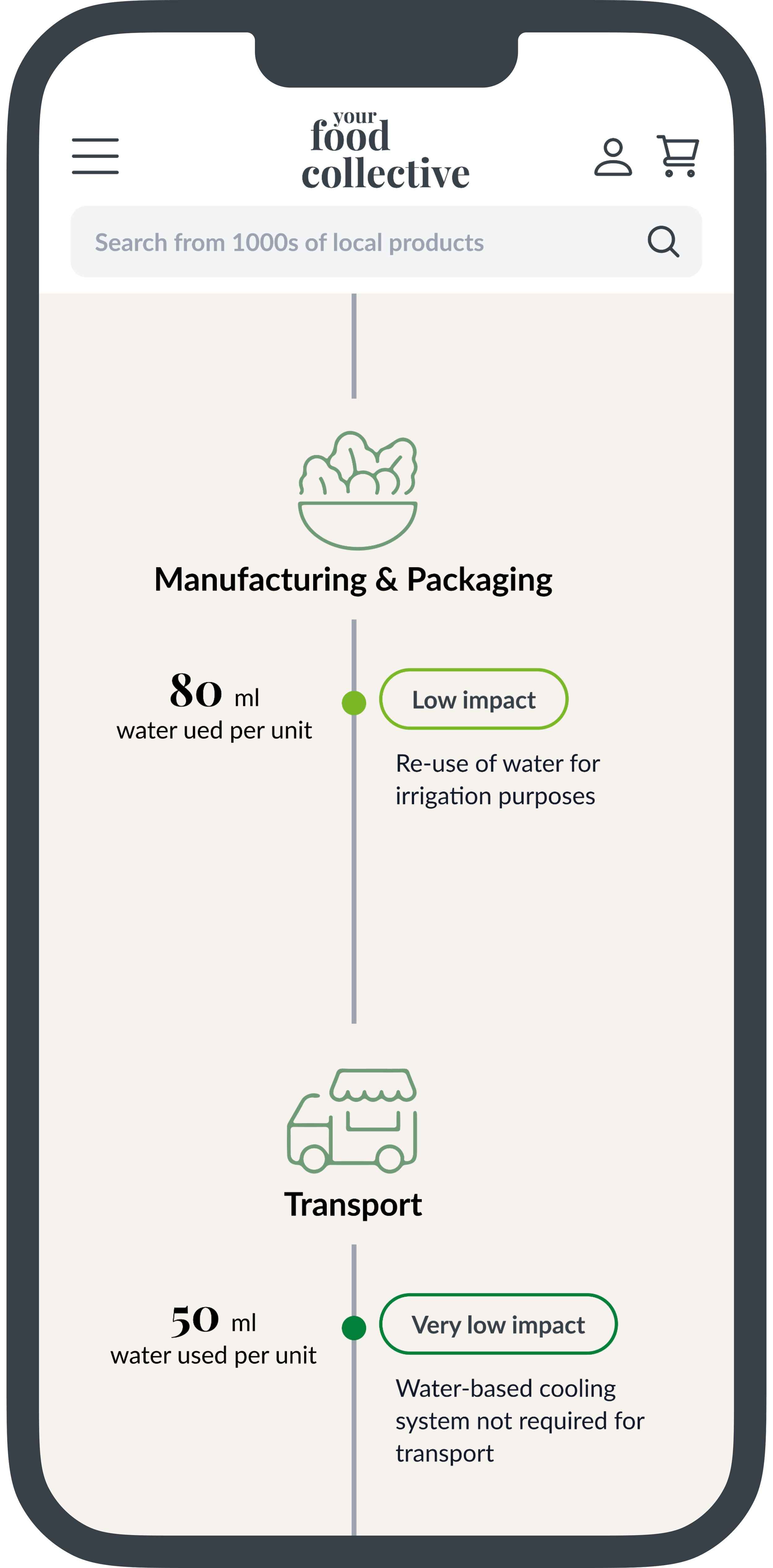
Two levels of information were required - an overall score and a technical breakdown including the supply chain impact. Using this reference as inspiration for methodology and dummy data.
Process
PROBLEMEco-conscious millennials want to shop low impact food but find it difficult to trust if a producer is greenwashing or genuinely sustainable
Millennials shop with their values and expect transparency from brands stating sustainability. But their knowledge how food production impacts the environment and why it’s important is only surface level due to lack of transparency in the food industry.
Sustainability information on the Your Food Collective store is inconsistent, vague, and unrelatable across the current shopping experience. This provides little value to help customers make informed purchasing decisions, leading to low add-to-cart and return customer rates.
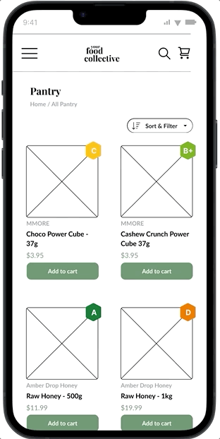
Original impact shopping guide appearing on category each category page
Relateable impact data in a positive context
SOLUTION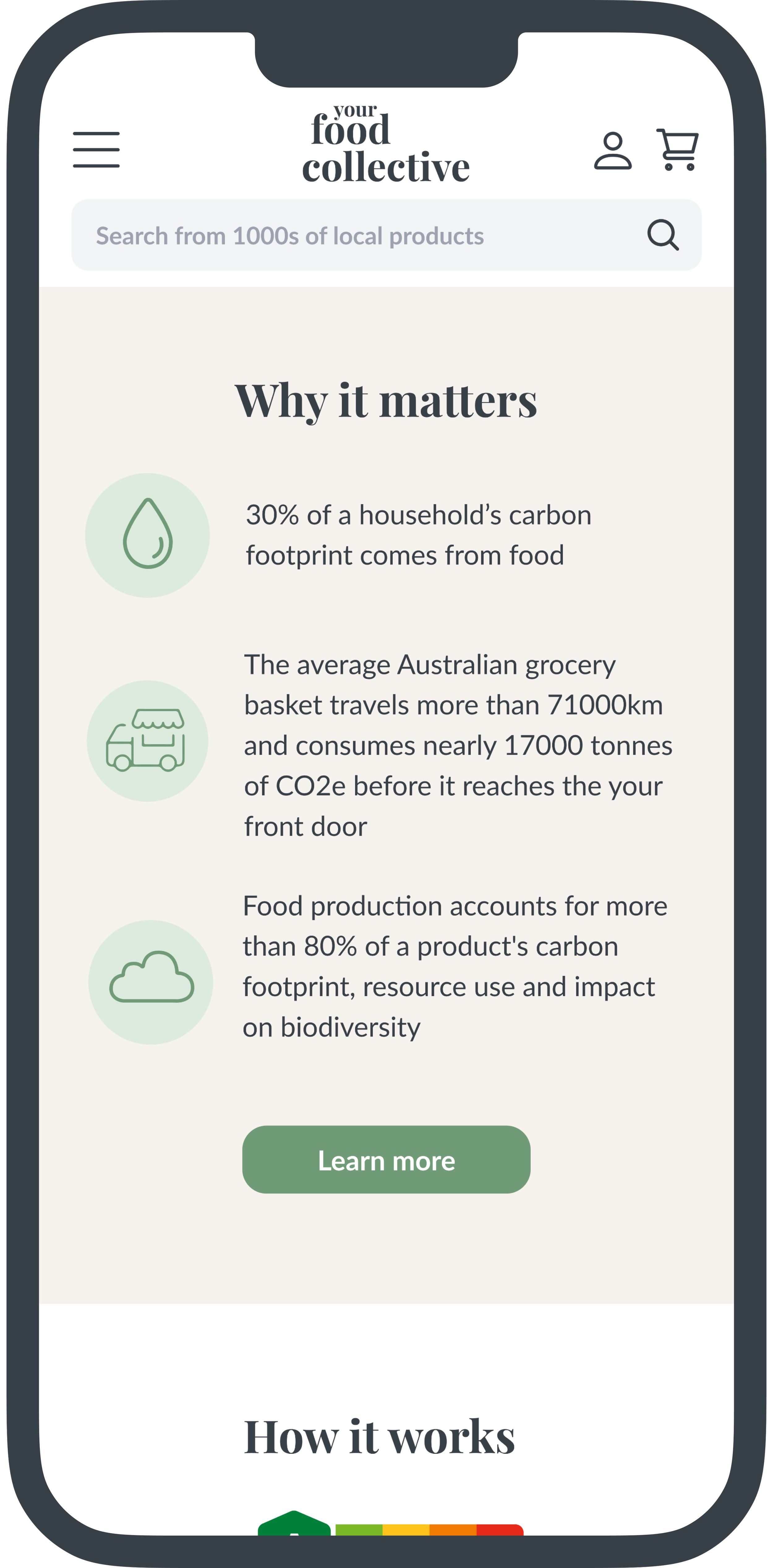
Company accountability
The final outcome redesigned the customer journey to include a how we rate page to substantiate the eco-scores given to products in a way that is relevant and familiar. It also reminds users before they continue browsing the reasons why it’s important to choose low-impact food.
Choosing better food conveniently
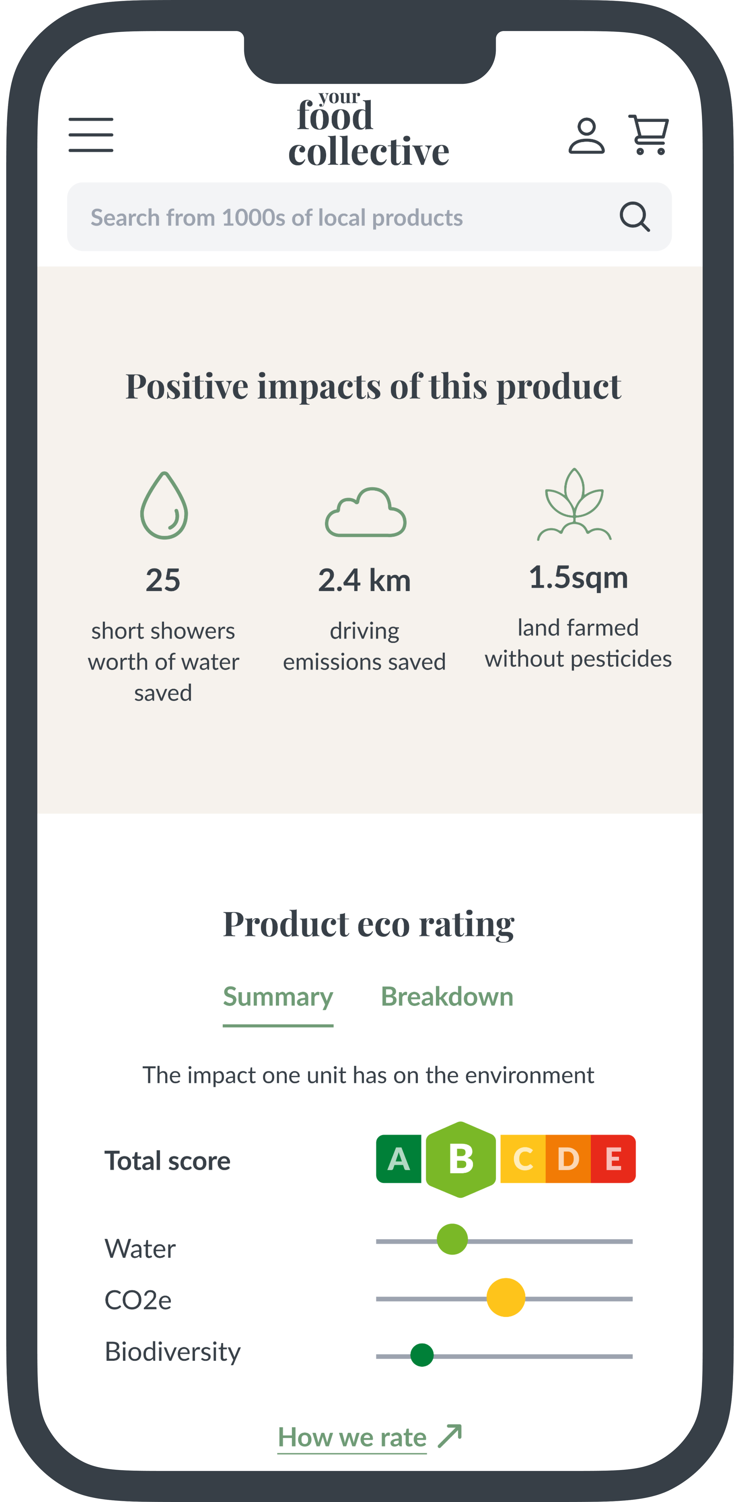
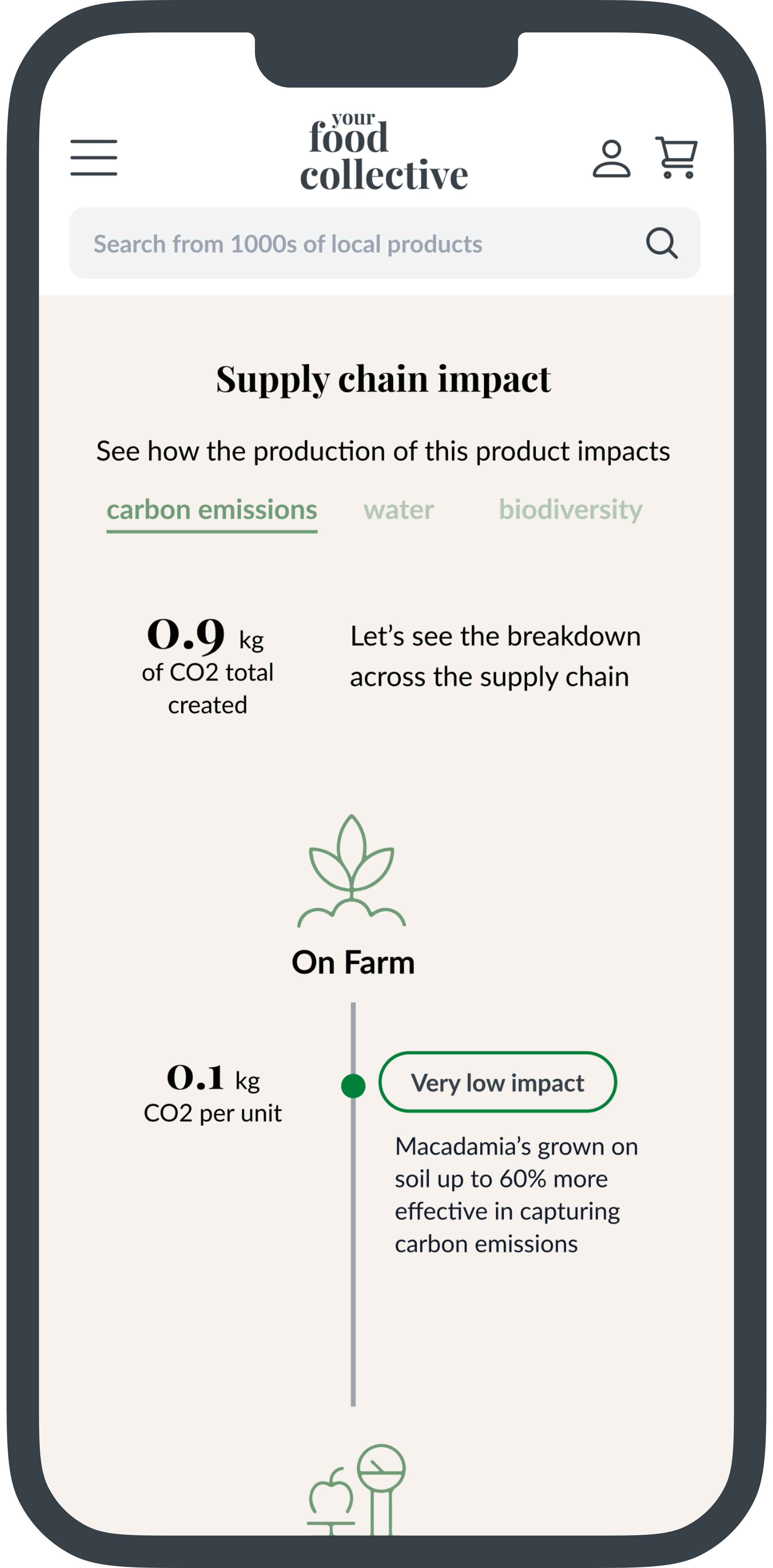
Every product page provides visibility of food production information that guides users to consider why this product might be a better choice for the planet.
With levels of digestible content to explore, users can make a better choice at a glance or choose to go further to learn more.
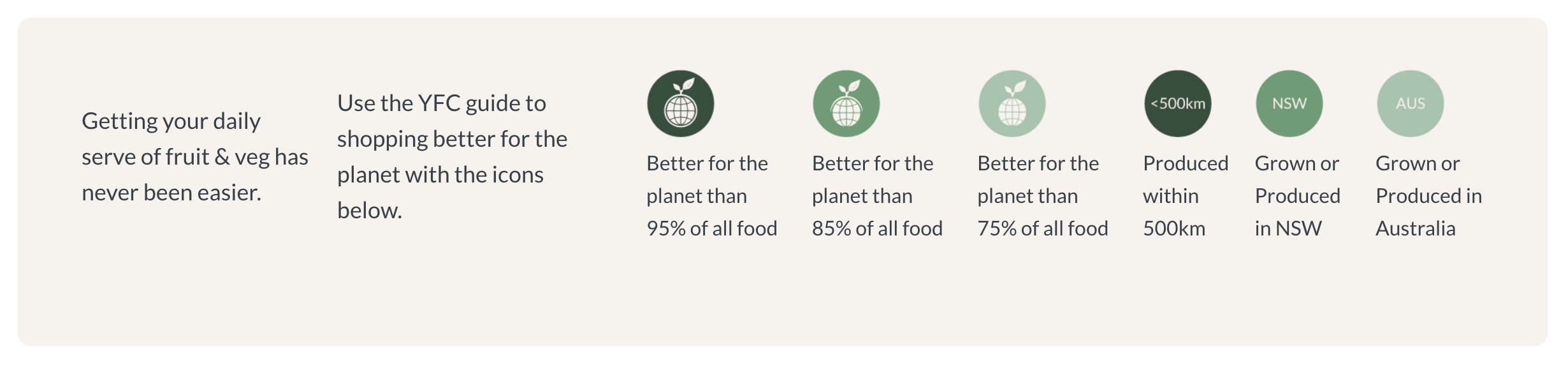
Relateable data
Adding everyday equivalences for saved resources and low-medium impact reference keys gives meaning to numbers that users can grasp, connect with, and feel positive about.
DEFINEEco-Conscious Emma
Based on what we learned about current customers from the stakeholder plus the eight usability testers from my personal network Eco-Conscious Emma was created - a persona to clarify the users’ perspectives, motivations, and needs.
IDEATIONSketches
After competitor research and a heuristic evaluation of the current website, I began sketching to quickly generate ideas.

Next, I explored a flow from landing page to cart taking into consideration missing information users need and when they need it.
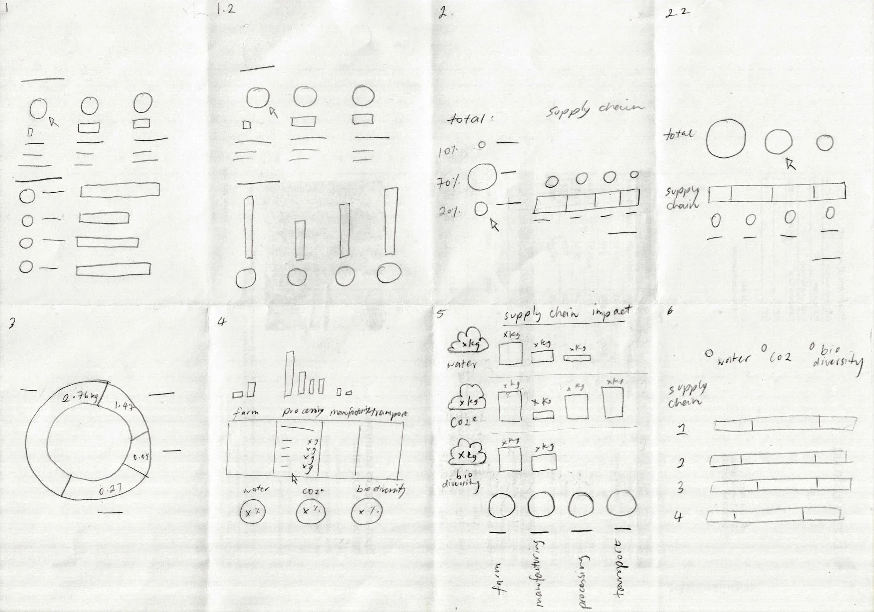
Here I explored the layout of impact metrics.
I learned in this exploration that visualising the supply chain horizontally was not going to work for legibility reasons on mobile.
USABILITY TESTINGTest 1
Using wireframes my first round of testing focused on getting the content right. Learning which format of impact metrics resonate most and what sustainability factors are important when shopping for groceries.
Key user insights
Graphs confused users and didn’t have enough context to clarify what is considered low or high impact.
Impact data resonated best in the format of everyday equivalences and perspective of the positive impact.
Users valued the transparency of material origin information highly.
Design challenges
Finding a way to visually communicate biodiversity impact alongside water and carbon emissions was difficult because it is not a resource. Choosing one part of biodiversity (land) was the chosen direction to fit consistently with water and carbon emissions saved.
In my second iteration, I increased the UI, finalised content, and made iterations based on first-round feedback for users to explore a flow.
Key insights
The supply chain breakdown built trust and brand accountability with users even if only 50% would spend the time to read.
Raw materials origin transparency was enough to promote locally produced USP. But “Produced/grown within 500km” made users think about food miles.
Those who did read the supply chain information found it educational. Giving context to biodiversity in food production in particular.
Design challenges
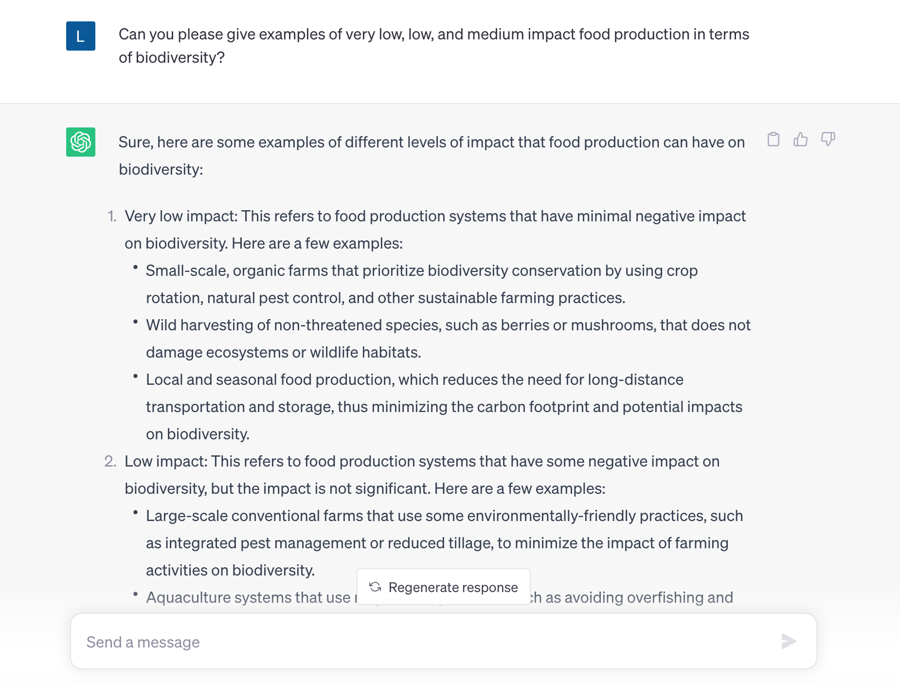
Lead by the user’s feedback for more meaningful data, I used ChatGPT and examples from Brookfarm’s regenerative farming practices to generate copy and build the foundation of the rating system. This paired with a familiar linear supply chain format provided bite-sized content in a context they could understand.
Test 2

REFINEMENTFinal Product


REFLECTIONBiggest lessons
Remain resourceful when access to domain experts is limited: At first, working with complex impact data and only one initial stakeholder meeting to gain domain knowledge was challenging. I was concerned the integrity of the provided dummy data would affect the quality of user testing, and once I started ideating I had a lot of unanswered questions about the rating system methodology. This project was a great reminder of the importance of staying resourceful and resilient. To move forward within the time constraint, I utilised producer information and ChatGPT to close my knowledge gap and produce an innovative data visualisation both users and the client valued.
Practical time management: This project was the first high-fidelity prototype I designed. In under 3 weeks, I rapidly learned how to apply auto layout, constraints, and new animation techniques while increasing the UI of wireframes and preparing for user interviews. This was a steep learning curve and was challenging to be patient but realistic with my use of time. With a usability test plan in place, I was able to prioritise my energy to the elements that were essential to user testing.
Choosing the right type of chart for your audience: In my early supply chain data visualisations, I was distracted by the challenge of finding a layout that was suitable for mobile. When first I should have clarified the most effective expression best way to tell a story for the type of data. I’m grateful for feedback in class design critiques that led me to research best practices and understand how to approach data visulisation in the future.

